Role
Lead UX Designer
Contribution
Design - Prototyping
Agile - Research
Collaborators
Web Strategists
Engineering
SEO Team
Project Manager
Background
In June 2021, my team was asked to do the redesign of our website's case study library. Based on prior usability testing, we knew there was a big opportunity for improvement in usability, visual design, conversion optimization, and SEO. We needed the website to be a more effective sales enablement and online resource for prospects.
So the question was: How could we redesign the case study library page to be more sales oriented but also a good resource for prospects?
The main challenges
- Sales enablement
- Scalability
- Brand & UX
- Acquisition
Previous look & feel of the Case Study Library Page

User testing results of current design
Before starting the redesign project we ran an unmoderated test. 10 user tests were done by July 2021, with an average test length around 15 minutes. Feedback was high level and general. This test definitely helped us as a base for further design exploration and improvements in the experience and visual design.
RESULTS
Main takeaways
- CTA was ineffective as its click-through rate was lower (6.4%)
- SEO improvement
- The filter bar is confusing
- Content too long and overwhelming
- The page on mobile and tablet don't have a nice experience or look
SYNTHESIZING THE RESULTS
Based on the results of the test, the team developed a theory that users were bouncing from the website because the overall design was too overwhelming and confusing. We could work on some small changes but we knew a whole redesign was going to have a bigger and better impact with the users, we didn't want them to arrive to the page and immediately leave.
After this my team came up with a design process, this process included different stages since the redesign got divided in three steps: Homepage, Directory page and Template page.
The design process
Define, for this stage we met with main stakeholders and we started with wireframes for the basic structure of each page and define priorities (related to content).
- For the template page the information architecture was updated so the content organization would make more sense to the user when reading each article and in terms of SEO this information could be easier to be link and find with certain keywords.
- In the Directory page, the bigger change was around the filters, in the previous design these were confusing and the visibility of the filter wasn't clear enough for the user, so we wanted to update this section to make it more prominent and easier to interact for the user, using a more intuitive and familiar experience so they could apply and remove filters without any issue .
Another big change we implemented for this page, based on the testing results, was a cleaner look and feel, so we could remove the overwhelming feeling and provide a more enjoyable experience when going throughout the content.
- Finally for the homepage and keeping in mind we were working with SEO team and web strategists, we approached this page in a way where content could be respected and accomplish SEO goals as well as (from a design perspective) keeping it clean and easier to navigate for the user providing also enough interesting data to keep the users in the page and improve the CTR (Click through rate). This way it could be a win-win for the design team and marketing team.
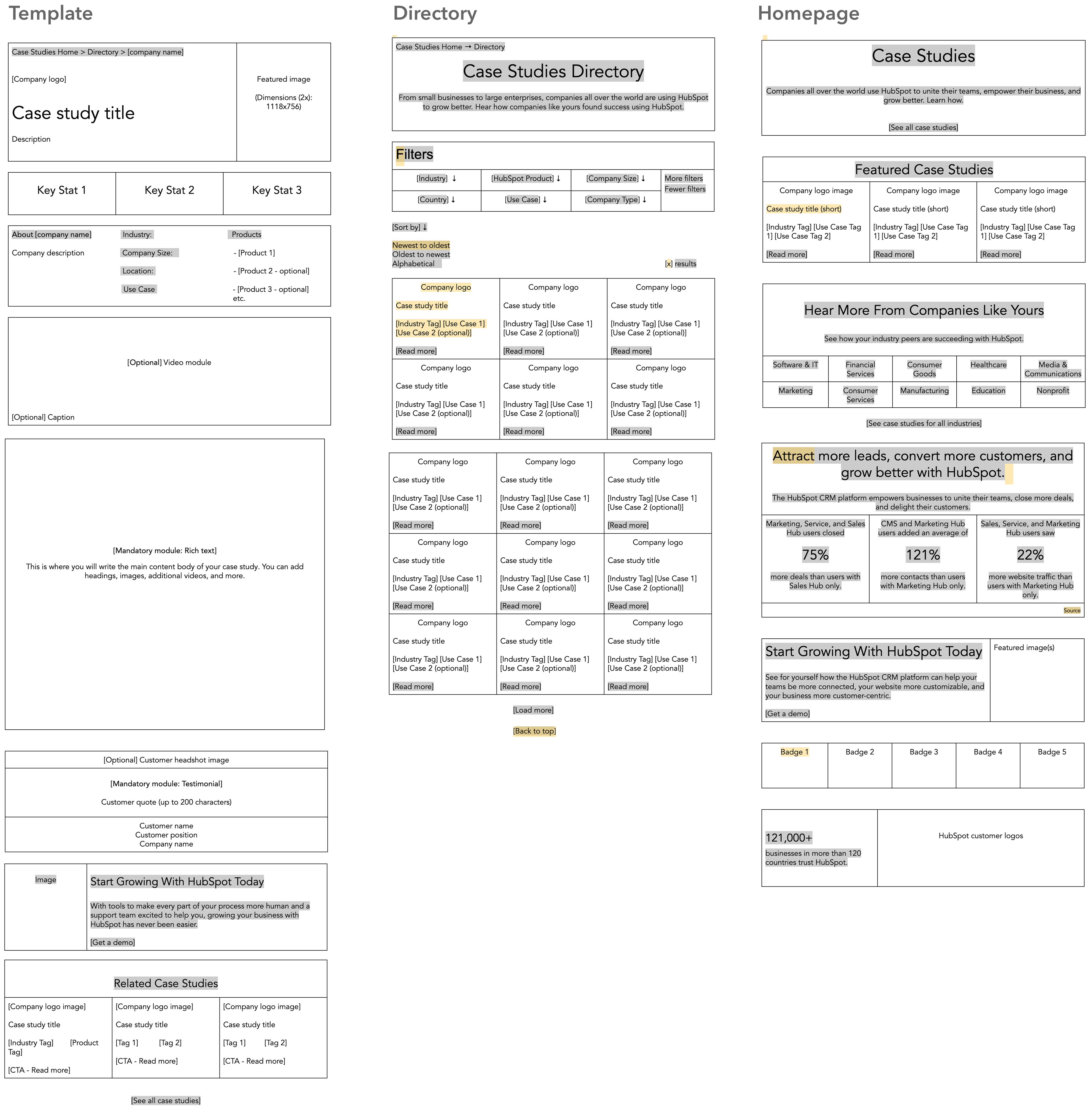
After many variations and discussions the three basic structures for the pages were approved and we could moved onto the next stage.
- Develop, for this stage we developed potential solutions aka prototyping for the product. We wanted to keep in mind the identity but also improve the user experience while respecting the brand. Here are the visual results of the pages:
Homepage
Header
Featured CS and Industries

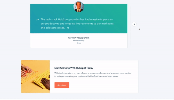
CTA
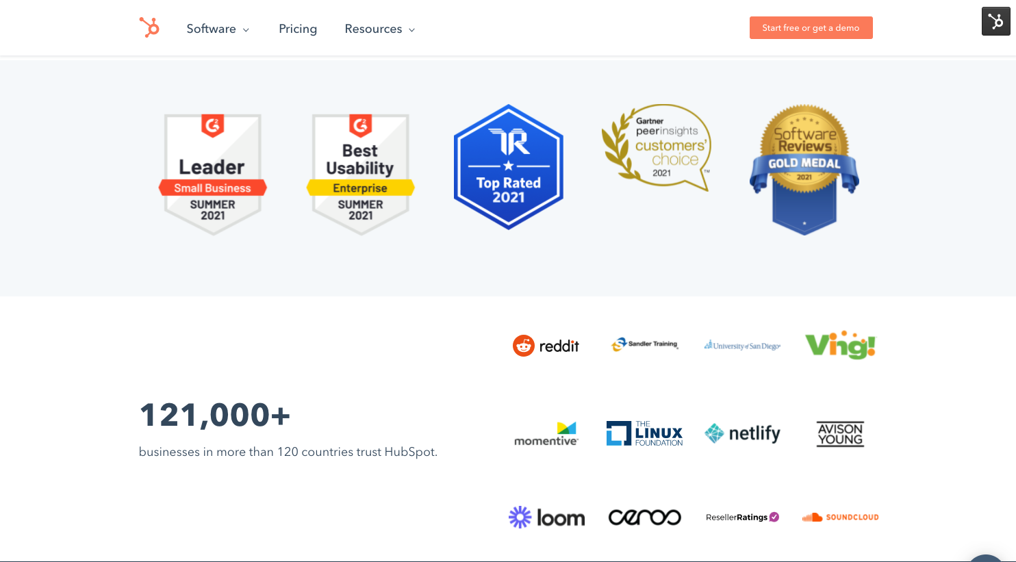
Awards Banner & Logo Banner
Directory
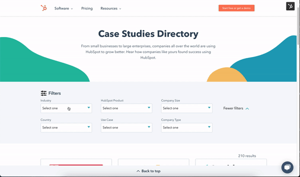
Header & Filters

Cards
Template Page
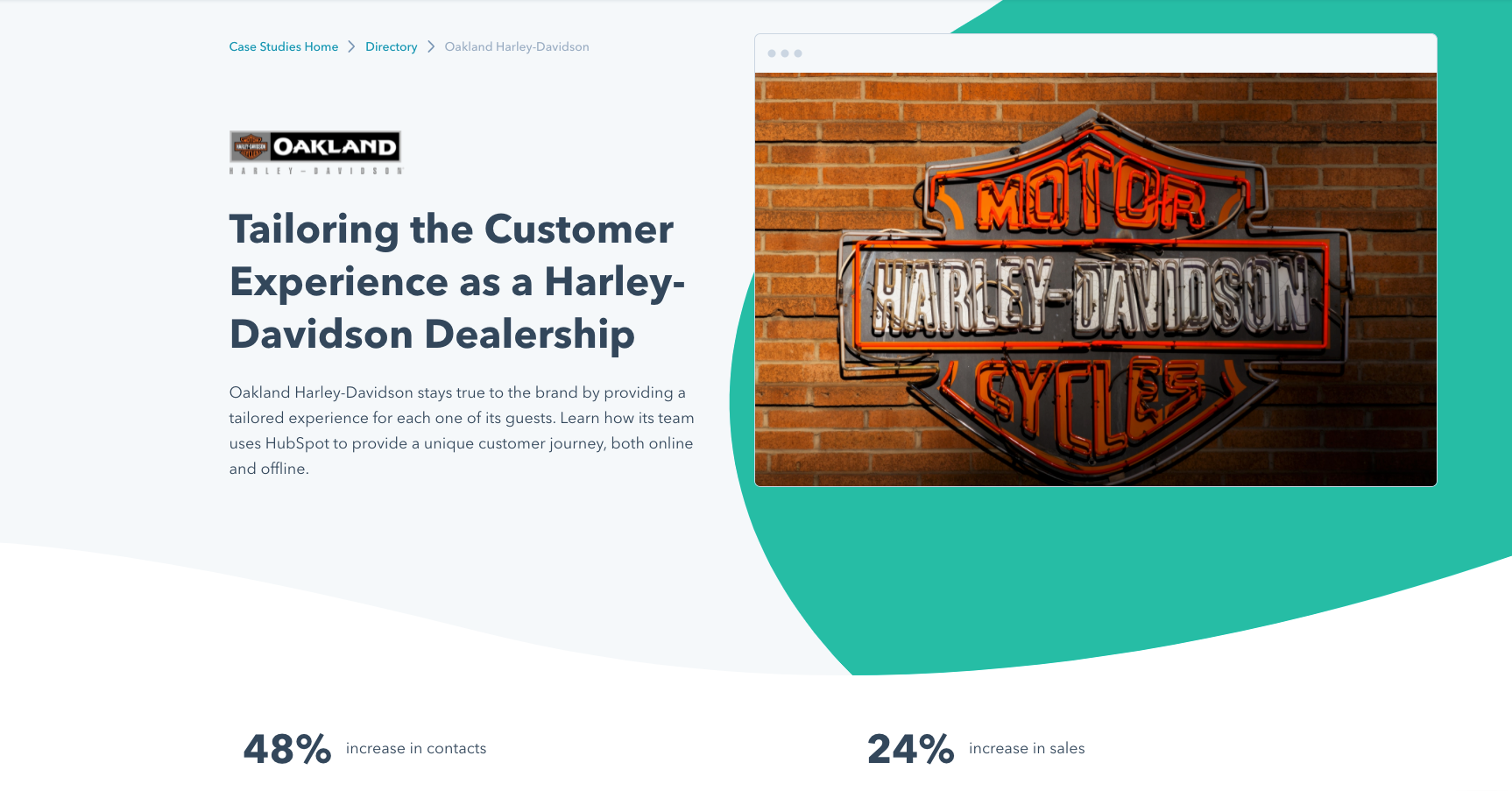
Header & Stats

About the Company
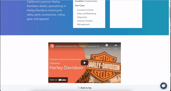
Body Content & Video
Testimonials & CTA

Related Case Studies
Achievements
After testing these new designs with real users we discovered that the engagement with the page and content was higher, the filters section was clearer and intuitive, and the cards and usage of videos and images were a winning option for the tests since it meant trust and clarity for the processes.
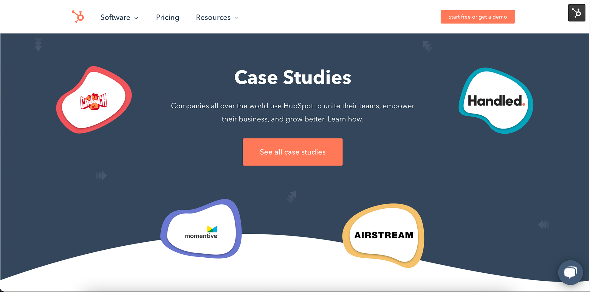
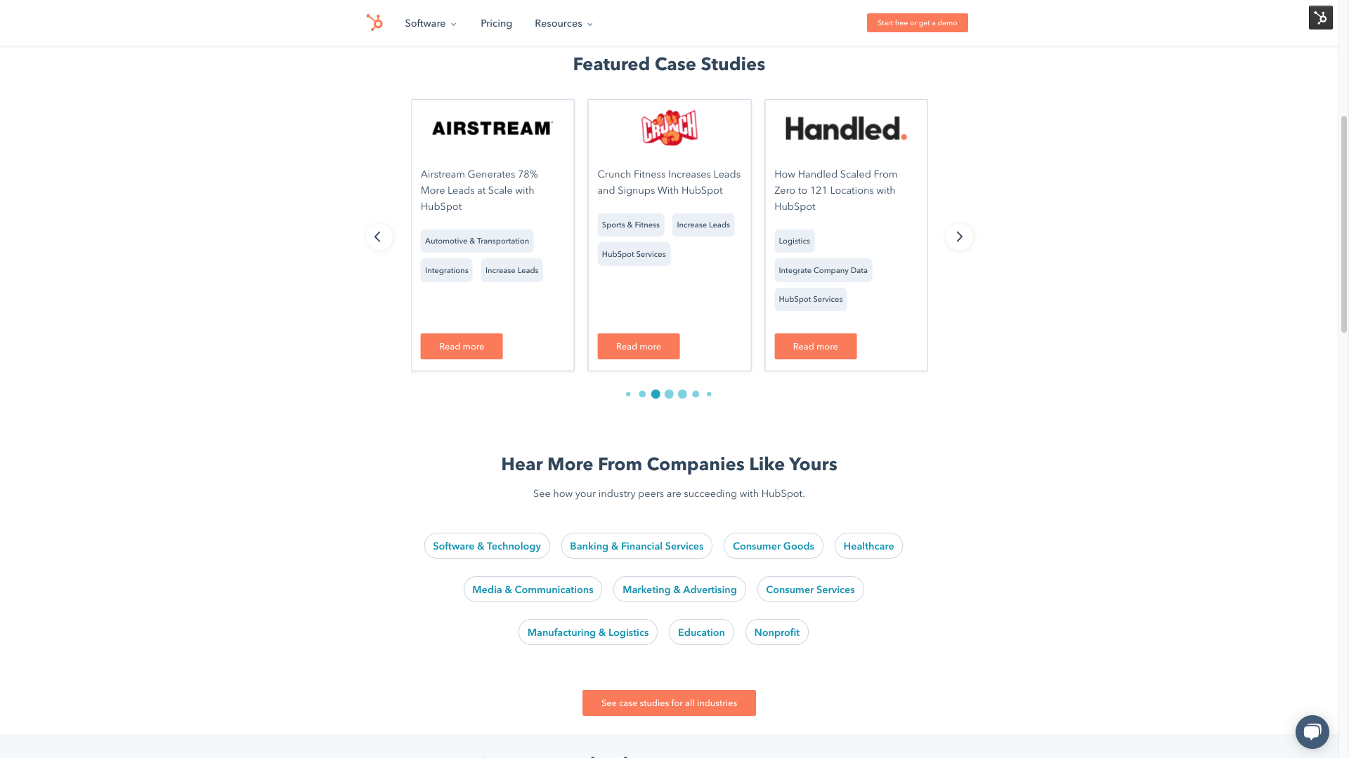
- Deliver, for this stage we deliver an experience with confidence. These are the final results of the work.
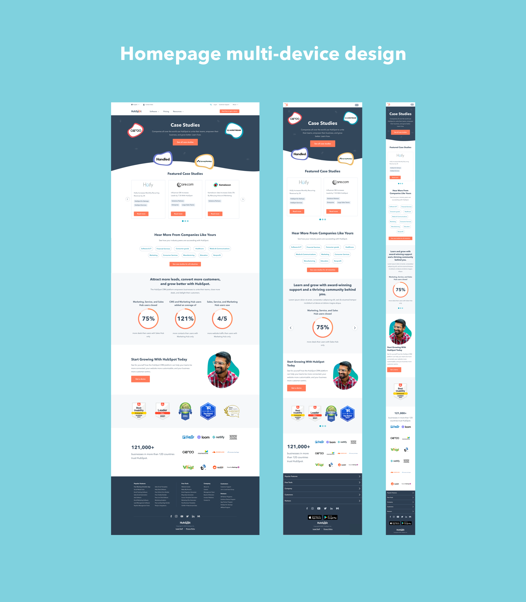
Homepage
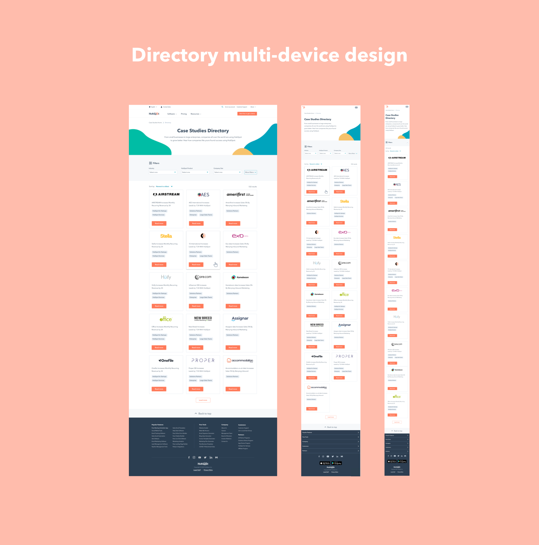
Directory
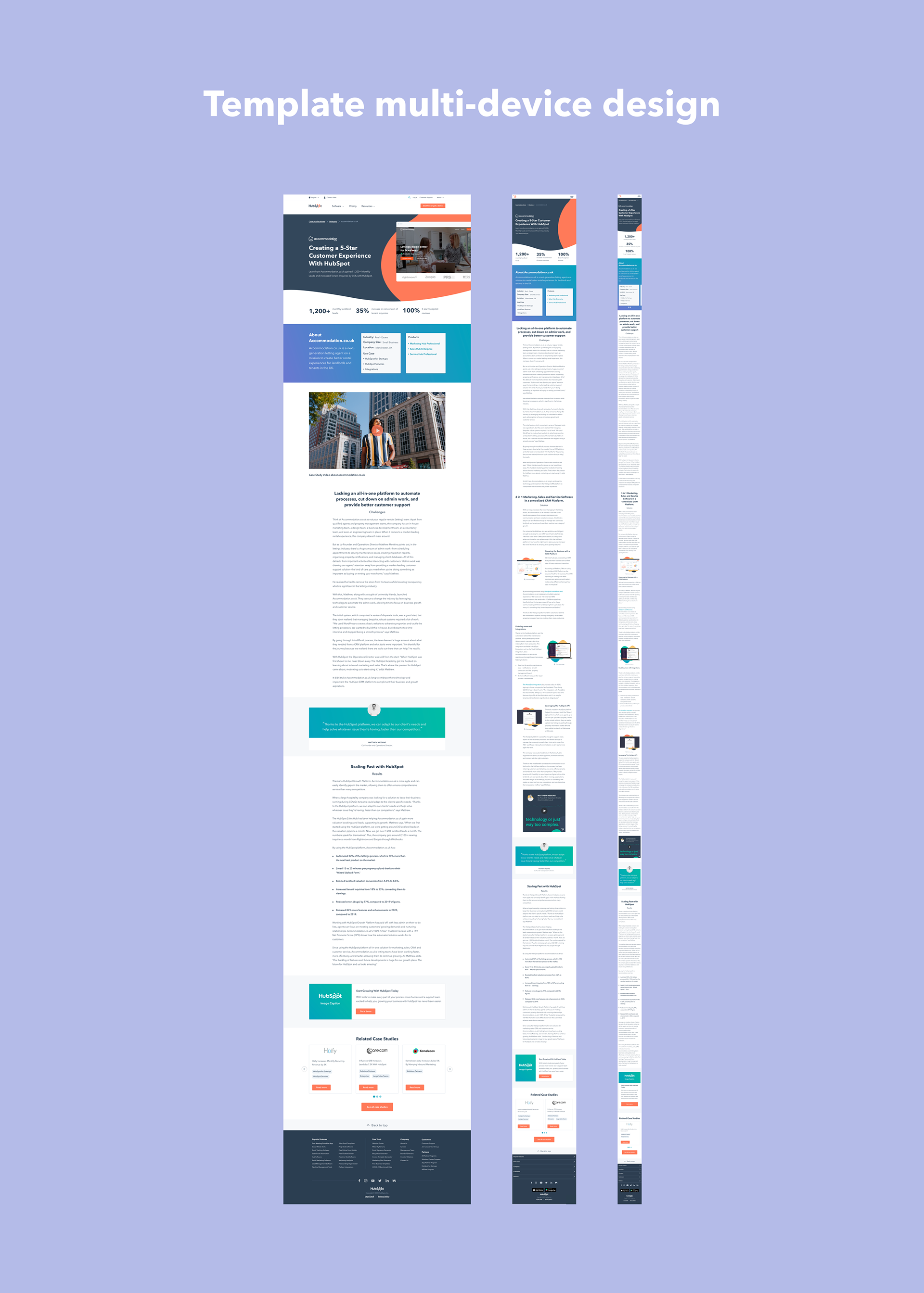
Template
Thank you :)